In today’s digital world that which we present to users is via a wide array of devices smartphones, tablets, desktops and even smart TV’s thus we must pay attention to the design of our sites which perform and look great on all of them. The two main solutions to this issue are responsive and adaptive web design. But what are the differences between the two and which one should you use for your business?
As a top player in the field of Sacramento web development, we at E-Digital see ourselves as business advisors through this choice. We will go in-depth into each option to help you choose the best one for you.
What is Responsive Design?
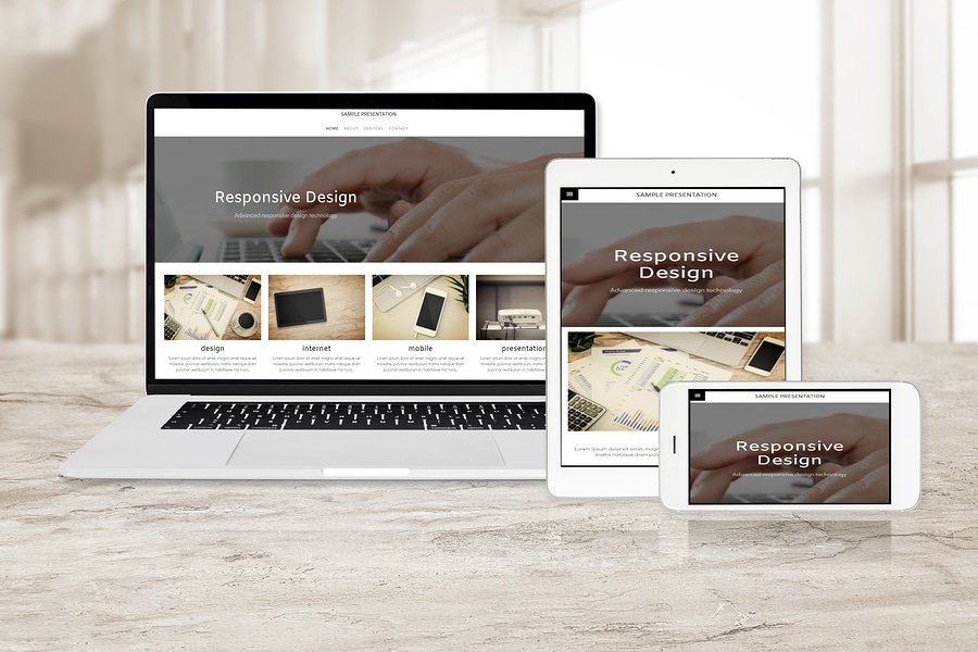
Responsive design uses a single layout to which you apply fluid adjustments as per the screen size you are working with in terms of pixels. Also, the content “responds” to the screen size and rotation of the user’s device and will adjust to fit any given platform.Pros:
- Consistency: One design for all devices, which in turn gives brand uniformity.
- SEO-Friendly: Google goes for responsive design as it uses one URL, which in turn makes for easy crawling and indexing.
- Lower Maintenance: There is a single version of the website to update.
Cons:
- Slower Load Times: For all devices the same content is used which means if not optimized it will load slower on mobile.
- Less Control: Content can not be tailored for device types.
What is Adaptive Design?
Adaptive design is a practice which puts out a number of website versions that are optimized for different screen sizes. At access time, the server determines what device the user has and serves up the proper version.Pros:
- Optimized Experience: Each is designed for a particular device which in turn gives you faster load times and better experience.
- More Control: You can tailor content and design to the device.
Cons:
- Higher Development Costs: Multiple sets of designs must be developed and updated.
- More Complex Maintenance: Updates are required for all versions.
Which One Should You Choose?
In what you choose between responsive and adaptive design we look at your goals, budget, and audience behavior.
- Startups and small businesses that are after a budget, scalable, and SEO friendly solution tend to go for responsive design.
- Large companies and media-heavy sites which put first performance and personalization of user experience across devices may go for adaptive design.
Final Thoughts
Both responsive and adaptive designs bring their benefits, which is to say the right choice is based on what you need. Responsive design is flexible and also very economical, which is the reason it is the choice of the majority of businesses today. Adaptive design, on the other hand, gives you greater control and will perform best for particular user experiences, although it comes at a higher price.
In whatever you do the base line is to put forth a smooth, engaging, and efficient user experience across all devices. For professional help and custom solutions, look to which Sacramento Local Web Service providers.